I’ve been using Datazen at one of my customers , and spoken about it with a bunch of other people about it, lately. People are starting to really get their eyes up for Datazen now, maybe because it’s free if you have a SQL Server Enterprise Edition license?
Anyways, I’ve met some challenges the last couple of days and I want to highlight some of them. I guess this is my way of putting in a few feature request. Maybe they are already on the roadmap, maybe not.
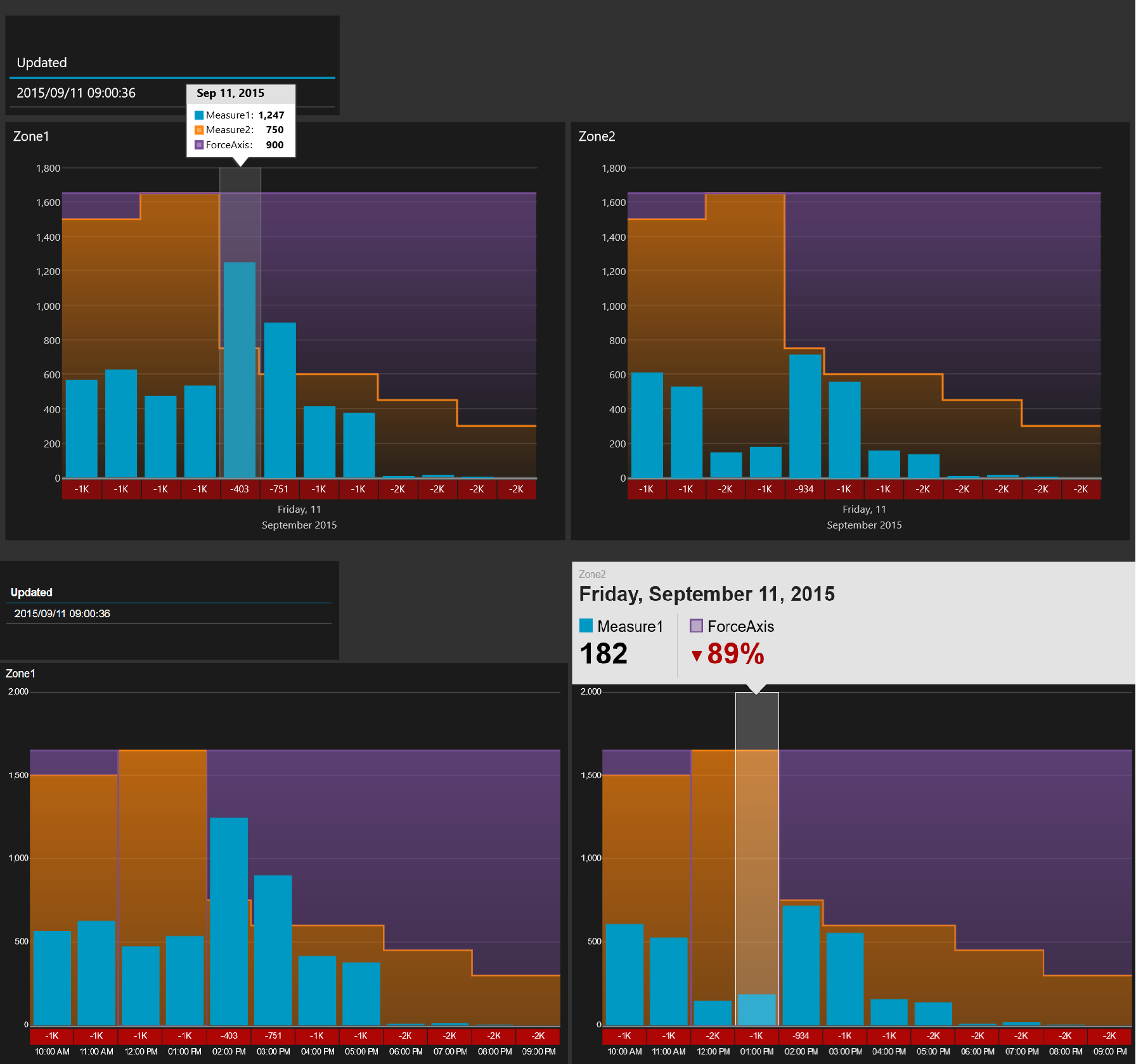
What am I trying to do? I need to compare two different zones with the same measure and compare it to another measure for each hour for the rest of the day. This comparison measure will change throughout the day and can also differ between the two zones. Great, I know what I am going to do! I’ll choose a “Comparison Time Graph”, choose my measures, choose hour as default time unit as and we should be good to go right? No!
Request 1: Fixed y-axis
First issue is that the axis’ are data driven, which is a nice feature in general, but in this case I need them to use the same axis’ for comparison reasons so I really wish I could have fixed axis’, or be able to use a third measure to define the y-axis. In this case I ended up calculating a third measure to force the graphs to have same y-axis based on the higest value in one of them. So I am now comparing measure 1 with measure 2 AND another measure to push the y-axis. This affects the comparison values below the chart however and wil now never go above 0. If i could chose to remove that difference value that wouldn’t be a big problemas the user could just use the graph, but I am not able to that.
Request 2: Same information in all viewers
Below I have the output from the Win8 app in the top of the image and the web browser viewer at the bottom. They clearly are showing different information. I want the hours to be displayed as in the browser viewer, but I want the tooltip from the Win8 viewer. I want to see the values of each measure, or at least have the option to do this. The browser is also only showing the label of one of the two masures I am actually comparing to.

Hi Martin, I am trying to put labels to show the values in the chart. Is it possible?
Hi Roberto,
At this point this is not possible. The “Total Chart” has an option to showing the percentage of total, but that is the only “legend” that is a number you can put on a graph. Other than that you are only able to put your categories, dimensions values, as legend.
Your suggestion is a nice feature and I hope they will add it. Graphs might get a bit clustered on small surfaces though so that might be why they haven’t included it yet.
Hi Roberto,
My tooltips won’t display in either Chrome or IE11 browsers. I can highlight the item, but they do not display at the top of the chart.
Appreciate your help, thanks !
hi can i rotated axix label in 90 degree in category chart. Another thing, can i use label in datazen